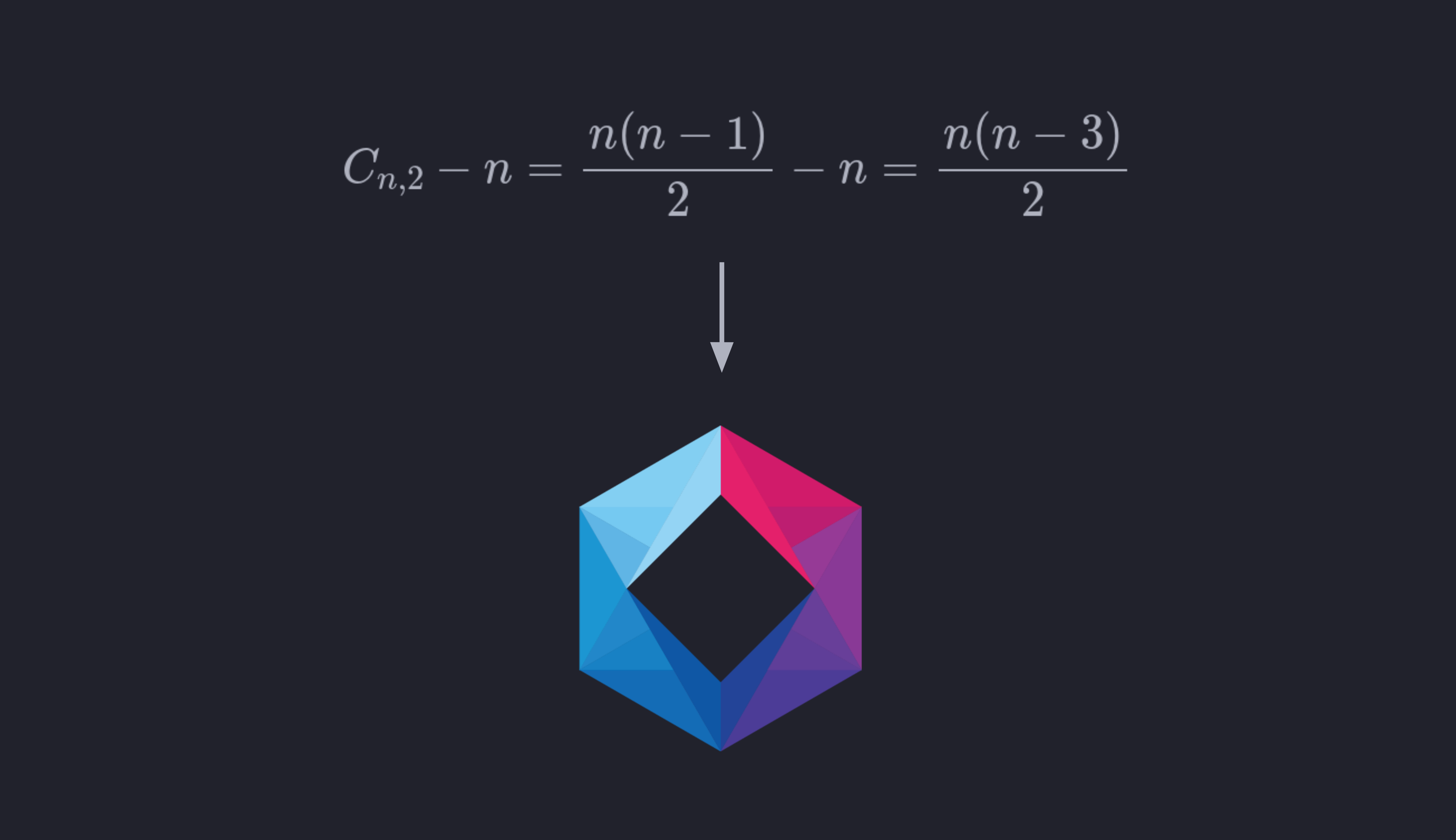
How I created my logo
The idea behind my logo came to me after struggling with the
infinitely fragmented knowledge typically featured in schools and
universities. Centralization and connections within each person's
knowledge base has since become one of my most important missions, my
main compass
Not surprisingly, some people also do get it, and have come to the
same conclusion, albeit through very different paths. For example, Dr.
Alan Watkins
The marketplace seems to be the culprit, at least in many regards. The more specialized you are, the more sought after you will be; generic problems can be solved by most, after all. However, this can backfire when the complexity of the managed system starts to spread along different subjects. That might be one of the major causes of why there's usually a critical mass or size for many companies before they crumble under their own complexity weight, giving rise to usually newer, leaner, less complicated competitors. The cycle of corporate life repeats, and humans, who have a hard time learning from their ancestors' mistakes, will have an even harder time learning from their less relatable corporate ancestors' mistakes.
This capitalist problem creeps into universities and schools as well, but maybe in a different shape. The more isolated departments are from each other, the easier it is to justify their own existence and budgets, the easier it is to make it hard for others to get anything done within your topic.
It's easy to spot why people find it hard and cumbersome to keep
everything connected. By laying it out in a graph
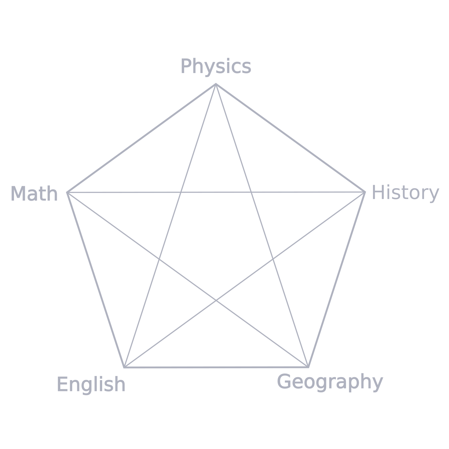
That's because they grow quadratically — \(O(n^2)\) —, not linearly — \(O(n)\). In other words, the number of connections, specially the inner ones, as we shall see, grows with the square of the number of sides, which is jargon for "boy, do they grow fast". But how exactly do they grow, you might ask?
It turns out that connecting dots is analogous to making
combinations of pairs. That means order doesn't matter, so we
can use the somewhat basic
combinatorics formula
Notice from above that the number of internal connections also still grows quadratically, even though the perimeter grows linearly. This is yet another justification for taking a strong stance towards connecting knowledge: connecting knowledge grows more quickly than gathering/creating knowledge sequentially, although creating the nodes is still necessary, of course.
But why exactly did I choose a hexagon shape for my logo? Is it just because it looks symmetrical and kind of nice?
Nope. I chose it because it stands in the transition between where perimeter connections are more numerous and where inner connections start ruling the land. It's the first polygon where the number of internal connections are higher than their outer counterparts, as you can see from the table below:
| # of Sides on the Polygon | # of Total Connections | # of Internal Connections |
|---|---|---|
| 3 | 3 | 0 |
| 4 | 6 | 2 |
| 5 | 10 | 5 |
| 6 | 15 | 9 |
| 7 | 21 | 14 |
| 8 | 28 | 20 |
| 9 | 36 | 27 |
| 10 | 45 | 35 |
| … | … | … |
The overall shape of the design is, then, settled, so what now?
Here are some extra decisions I had to take in order to get to the end result:
- I decided to take out the center part of the connected hexagon because the outer edges already represent the connections sufficiently, and it also seemed to be bloating up the logo, there was too much information within it. The inner part is also not a hexagon, but a square, for mostly the same reason: a square seems less complex than a hexagon.
- When coloring, I confess I ran out of ideas. But then I thought: running out of ideas should be in the design: how about random, pretty colors? So I searched for a nice gradient — I find that good gradients can lend a design smoothness and a sense of calmness —, this set of colors is used a lot in modern app design. If you're inclined to interpretations still, I would say this light-blue-to-reddish gradient could represent some sort of warm-up, in the sense that more connections are activating the global network more.
-
You will often see non-pointy designs nowadays, or shapes with
smoothed corners. That comes from a psychological inclination humans
have towards pointy objects
— like knives —, which call our attention because they usually represent danger. So, naturally, I, at first, wanted to smooth the corners a little bit. However I ultimately reversed my decision so the logo would stand out even more. But that's something I might change in the future, I don't know.
So what do you think about my logo and its reasoning? Great? An amazing example of overengineering? Maybe you think the equivalence between knowledge and graphs is a false or insufficient one?
Personally, working on the connections throughout the past few years has been both a source of relief and pleasure. Not only do I have access to basically every piece of knowledge I possess, no matter in which subject I am, but the connections themselves seem to generate knowledge, not only the nodes.
Originally, I wanted to create some sort of surrealist logo based on
an iconic depiction of Diogenes of Sinope, an ancient Greek Cynicbit considerably
above my paygrade, I don't have the know-how. I've even tried to
contact Murugandi

Additionally, if you're interested in learning more about design and its craftsmanship, I highly recommend:
- Daniel Scott: he is an Adobe-certified instructor who happens to also be an amazing teacher. Design can seem very cryptic, and specially hermetic to people like me who can't draw anything — I still can't —, but, believe me, you can learn design, with computer-aided graphic tools at least. Daniel's courses are available both on Udemy and Skillshare, from total beginner to advanced.
- Aaron Draplin: an incredibly experienced, top notch designer turned teacher who just rocks at explaining how to bridge theory into practice, a master artisan. His content are a must-have for anyone taking this craft seriously at some point. His courses are exclusive to Skillshare.
- The Futur: the design community has established a rift when it comes to The Futur and its creator, Chris Do. Some people think he's a charlatan, but I encourage you to evaluate it for yourself, because I certainly do not agree with that assertion. Some of Chris' tips helped me a lot in many aspects of life, so I deem his work as a very valuable asset to the community — for example, watch his lecture on pricing design work and creativity, it's one of his most iconic videos. I do admit a lot of his design work is very simple, and many of his videos are repetitive, but the overall product is just priceless.
- Go have a laugh with this masterpiece of a parody, from the YouTube channel Kantega AS.
Sorry for the delaying this post so much, it took me 10+ months to start working on it, after finishing my design. I waited to see if I would change my mind with respect to the design, but, so far, I still like it and stand by its logic and ideas.