Thumbnail

A Weightlifting Logo

After seeing my previous logo designs — my and the logos —, my Olympic Weightlifting coach, Rogerio Sousa, asked me if I could make a logo for him.
Final Logo
The image I posted on instagram had slightly worse centering for the face. That happened due to a lack of attention when I was finishing the design: I put the text in and didn't realize that its center would not necessarily coincide with the rest of the image's.

Initially, he gave me a picture with insufficient contrast, which would be a lot of work for me, since the Image Trace from Adobe Illustrator wouldn't be able to work that well. And, thus, I asked him for a picture with more lighting; Image Trace works better when there is great contrast for making icons, i.e., extracting the most iconic features of the image.
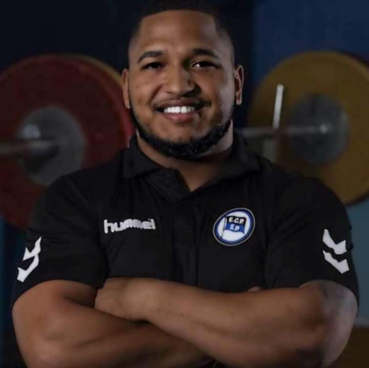
The initial picture.

I suggested he took a picture similar to one in which Dmitry Klokov, and others, are holding the barbell and the plates trying to emulate a warrior's pose.
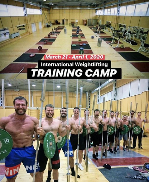
Klokov Warrior
The original post can be found here
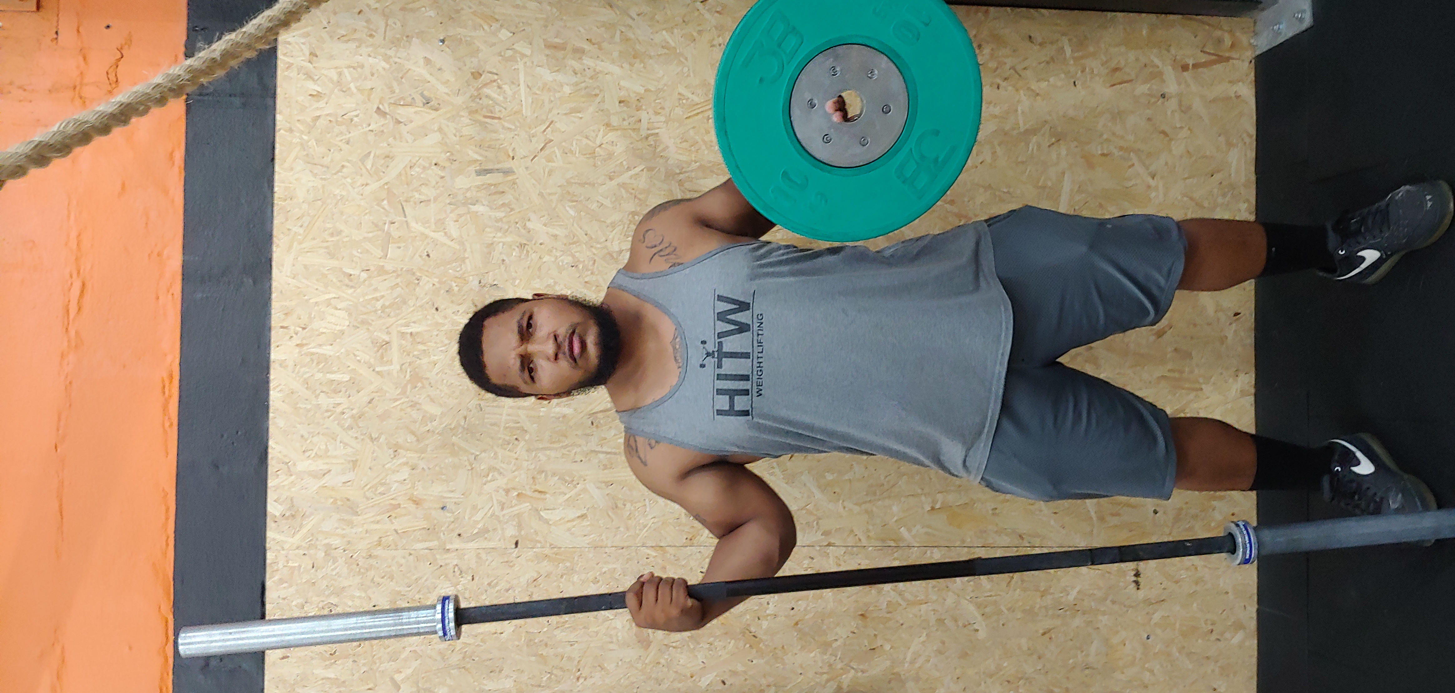
Plate Barbell Warrior Initial Picture
The photo we took featured the warrior's pose and much more lighting, specially on his face.
Bonus Logo
The bonus logo, an abstraction on the snatch position. The slight asymmetry is intentional, I think it gives more realism to the picture, although I would probably have to work a bit more on it if I were to really use it as a logo for something.

I've shared the design process on Instagram, but you can also check it out on YouTube. As a bonus, I've managed to make the snatch logo originally on his T-Shirt more abstract and, thus, creating a new logo in and of itself.